21 July, 2011

The Design of Food

FOOD PYRAMID VS. MY PLATE

Sometimes I feel lost and out of the loop with everything else that is going on in my world. Not only did I miss the infographic designs for the new US Food Pyramid submitted earlier this year but I missed as a mom that as of June 2011 our children are no longer learning the old triangular model. Below is the diagram of My Plate, the new infographic to teach our children how to eat a balanced meal. Certainly much more attractive and easier to read then previous versions but will it hold steady as long as the mighty pyramid has?

The reason this all came about is that in between swim lessons, art class, ballet class, playdates, library visits and more the kids and I mapped out nine weeks of themes to keep us busy over the summer. Last year during our move from Virginia to Seattle my children were out of school from April until September. I did my best to keep home schooling up and running but it was no easy task. By September I was pulling my hair out and the kids were so board. Therefore this summer had to be different.

So far we are on a successful role with week one: the human body. We visited the dentist, who spoiled us and showed us more about our mouth and teeth then I ever knew my entire life. Now this may sound boring but we have a super fun dentist on the shores of Greenlake, Greenlake Children's Dentistry. Relaxed, modern, open, bright, gold coins for good kids that work in the toy machines at the end of the visit, a wonderful dentist, Dr. Troy Hull are a few of the things that make this place great but best of all is the office dog, Clover. Next we visited our family doctor in Ballard and to finish out the week we made a painting using different parts of our bodies (besides our hands) and traced large self portraits to color in as the kids saw fit. 

Following up this week is week two: food. During the down time this week we have gone grocery shopping with our food pyramids and tallied our purchase to see out we eat. Thankfully we topped out on fruit and grains with only a couple sugars. This week has also focused on evening family walks and using the new My Plate diagram to eat our lunches and family dinners. The children love choosing what to fill their plates. 


Now the design part of this comes in the actual infographic challenge that took place earlier this year. Some of the designs I looked at were more confusing while others were so simple and clean. It is such a joy to look at information and be able to decipher it without much effort. I think a lot of times people think graphic design is hiring someone to make a product pretty but there is so much more to a design if you choose to put a message behind the image. Below are a few images from the challenge I found graphically interesting however if you want to see more follow this link, www.good.is/post/submissions-design-the-new-food-pyramid/.


What I found the most intersesting about the new My Plate design is that to me it seems like a direct version of what the UK uses. This got me thinking though about different cultures and how we all eat differently. Does that mean the food graph changes? The basics seem the same but yes we all eat different graphically speaking. Here is a look at the UK and a Chinese food chart.


Next I wanted to see what was out there, product wise to help my family make good eating choices. To tell the truth I think I have found a void in the marketing industry and in the next few weeks the kids and I will be visiting the ceramic shop to make our own versions of My Plates on real dishes. What I did find were two awesome designs but only two after quite a while of searching. Pictured at the top of this post is the Nutri-Plate and a less visual but just as user friendly and easier to measure plate is the Portion Size Matters.  

Learning to eat healthy is not the only important thing about food at our house it is also learning how to eat sweets, fats and junk-food in moderation with limits. So to finish out our week about food the kids, grandma and I will be visiting Boehm's Chocolates tomorrow to take the factory tour and see how a candy chocolate is made. The best part is we get to taste samples. If pictures are allowed I'll be sure to post the tour for all of you to enjoy too. 

I'm curious would you buy a My Plate design to feed your kids with?  

19 July, 2011

Homemade Game Shows

My mom is a huge party thrower and by far one the best hostess I have ever known. When we were kids her and my dad were known for their yearly party that featured a huge scavenger hunt throughout the house and the neighborhood. I remember months of planning just to have our house turned upside down by crazy adults in search of a win. But as they got older and injuries became common in the game she said goodbye and began to welcome in the Annual Johnson Family Fourth of July.

Whatever the event's title a good time, tons of food, an amazingly fun game, entertainment for all ages and GREAT family and friends has always been the lesson she has taught me. This year's Family Fourth was no exception. In past years she has hosted a carnival, a poker tournament, The Price is Right, Wheel of Fortune and so many more that I can't remember them all. What I do recall though is all the fun we have in hand making the games. The picture you see here is a 4-5' by 4-5' plywood board hand painted by me to resemble the famous Family Feud. My brother always handles the technical side and this year he made a time sensitive buzz in button so that the two teams could face off like the real show. My folks are the ring leaders and run the show during the big day and this year my dad was quite lively especially during the final speed round of answers.

Over the summer if my folks clean out their garage I'll try to take pictures of the "Cliff Hangers" game and "Wheel of Fortune" that I helped hand paint too. Somewhere in there is a "Plinko" board as well but I'm pretty sure all I did that year was help spread some glitter.

I'm trying really hard as my son gets older to talk him into having a game show birthday but to no success. Maybe I should just give up on him and here in a few years host a fun fortieth for me.

Formerly known as a Chrysalis

Thank you to our Aunt Sonia for such an awesome present. It has been about three weeks and my family and I have had such a joy watching and learning about the life of a butterfly.

When we originally received the present several weeks we were so worried about the caterpillars we thought were inside but we quickly learned that inside the box was a postcard to send away for our caterpillars. So online we went to Insect Lore, www.insectlore.com and ordered our caterpillars.

Four days later a simple brown box arrived in the mail. Screams of joy and excitement met the poor postman at the door with the realization of what was inside was.
 
Above on the left you can see what originally came out of the box. Two containers filled with ten tiny caterpillars and a one week supply of food. To the right you can see the amazing growth of those original tiny caterpillars within three days. We were shocked to say the least at the speed of their growth and the size of their bodies.

A few days later inside the cups the caterpillars started spending more and more time hanging from the lids in preparation for their transformation. Once they were ready the chrysalis started forming. I think the biggest surprise we had during the life cycle was just how hard the chrysalis were. I had to remove two of the chrysalis that fell from the lids and to my surprise it was like having two small pebbles in my hand. Not what I had expected.

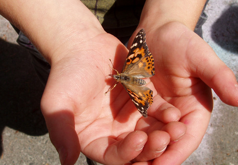
The best part of the journey was by far the release of the Painted Ladies into the big wide world. We waited for a warm, sunny day and some simply flew for the sky while others decided to stay around for awhile and visit with us. I love this picture of one butterfly that rested in my son's hands for quite some time. 

We also had one butterfly (lovingly named Nemo) who didn't fully develop a lower wing and we really went round and round on whether or not we should release him. What if he couldn't fly? What if he was eaten right away? But in the end we let him go with the rest of his family. At first he just sat on the sidewalk, then we moved him into our herb garden and finally when we placed another butterfly in there with him the two flew for the sky. It took Nemo twice the wing flutters and twice the effort but we cheered as we watched him go beyond the roof line. 

14 July, 2011

The Sketchbook Project 2011

It is official, my sketches have been uploaded online at The Art House Co-op, www.arthousecoop.com through The Sketchbook Project 2011, www.arthousecoop.com/sketchbookproject2011 and are on tour across America for everyone to check out. This was a journey that my husband and I set out on together. We thought what a great idea to join a sketchbook project together and once or twice a week we could put a movie in and sketch together like we use to before we had kids. Well... we lasted about three weeks before life got away from us and we seemed too busy to work on them together or at all. My husband succeeded quite well and completed his book although I am a tight illustrator and completed a total of twelves pencil drawings. 

"Happy Thoughts". When my little red sketchbook arrived it was assigned the theme happy thoughts and I thought how perfect but it wasn't as easy as you would think. I spent several months just trying to think about what makes me happy and considering the rough year that my family and I went through it simply made it even harder. One day when I was thinking about "happy" I found my fingers flipping something in my coat pocket and what I pulled out was a small silver star engraved with the word smile. It warmed my heart knowing that my great friend Amy Young Myhre had given it to me to remind me everyday to smile. So I decided I would set out to draw some of the Happy Little Thoughts of my life that carry such a special meaning no matter where I am.

The most exciting part is that I have had people take a journey through my book as the pull it off the library shelf and stroll. I have someone who has marked me as a liked artists and that is super cool too but by far the best part is having a book a real book in The Brooklyn Art Library with a real call number; 018.7-10. Please if you ever get a chance once the book tour is over go look for me in Brooklyn. Maybe my illustrations and you can have a cup of coffee together. 

If you want see the drawings on-line here is a link to visit my book, www.arthousecoop.com/users/lyonlingo/artwork. I'm also posting a bigger picture of one of the small images. This was such a fun project and it is open to anyone even children so why not order a few and get the family drawing. My kids have summer journals and sketchbooks but a book like this one is so real and official that I think my kids would enjoy it just for that alone. Do you do long term projects like this or are more of a quick fire challenge type of person who sits down does a speed sketch and then moves to the next thing? Let me know what you enjoy to do with your kids short or long term.


The sketchbook page pictured shows a cake the size of a quarter that I made with Fimo dough for our dollhouse. Sometimes the kids and I really enjoy sculpting tiny replica objects just for the challenge of it. The hardest part was trying to sculpt those tiny roses on the tip of a pin. Pictured on the right is a quarter. My son is into earning money and I had just spent the morning trying to scrape up $1.00 for the weekly allowance. Success came in four quarters and one become a size relation for my tiny cake.

The Joy of Goody Bags

For some reason I just love putting goody bags together for my kid's birthday parties and trying to snatch up the best deals to fill them with awesomeness for a reasonable price. Then if I ever have extras, since sometimes you have to buy in tens, twelves or twenties to get a deal I sell the extra goods on Ebay as pre-made goody bags. Never have I not had a set sell for a profit.


This year I bought an array of inexpensive paper bags so they would make a beautiful rainbow when they were arrange for the guest to take home. Next Max and I lined them all up on our kitchen floor and when to town throwing paint across the group of bags. He had the time of his life and the results turned out awesome as you can see in the picture above. In fact they turned out so good that parents picking up wanted to know where we had bought them. I love it when something turns out great!

Then we filled the bags with art supplies and candy. We included an art smock, the sand pen, two pieces of sidewalk chalk, a sable paint brush, several pieces of watercolor and charcoal paper, three colors of paint, some dumb dumbs, nerds and no party is complete without a bouncy ball and stickers.

With ten smocks left over I think I'll try to turn them into Build-A-Bear aprons for Sara's party. I'll let you know how that turns out.


09 July, 2011

The Color Wheel of a Seventh Birthday


Color, color and color, white, pink, red, orange, yellow, blue, green.... The birthday party was so full of color that even though it was raining outside no one seemed to notice especially me. As guest arrived at the party they were greeted out front by a huge balloon arch that my husband and dad put together as well as a handmade welcome sign that my son made all by himself.

Hiding in our carport was the highlight of the party. My mother so kindly spent her morning filling dart balloons with tempera paint for the dartboard. The filled balloons were attached to a piece of foam board covered by huge sheets of white paper for the kids to throw carnival darts at in the hope to pop them. I've heard this was a interactive art exhibit featured at Woodstock but not being able to attend I cannot confirm that fact. You can also see the art in action in Disney's Princess Diaries the movie. The kids just couldn't get enough of the dart throwing and continued to go to the end of the line so they could have yet another chance. My poor husband stood out there for over an hour until every balloon was gone.
The results came out awesome and I used the painting as a backdrop to take a picture of all the kids. We ended up using the printed picture as our thank you cards which turned out awesome.

To fill the three hours of fun we had many activities for the kids to do and I loved that almost everything we did resulted in another goody for the kids to take home in their party bags. In the kitchen we had fabric pens and art aprons for the kids to decorate although I did not know that seven-year olds are too cool for art aprons. No matter they still seemed to enjoy the coloring and we had a lot of fun results. (I can't find a picture of the aprons right now so I'll take a new one to add to this post later.)
The other favorite at the party was making sand pens. I found these great kits at Tuesday morning and although they needed some super glue modifications all the kids from 3 to 7 were able to make some amazingly fun pens. I ordered some extra black sand from Ebay and it worked great at making the other colors of sand pop. I just love the super bright colors don't you?

The kids also had a great time playing Pictionary. A friend of mine suggested this game for the kids and they had a blast drawing and screaming. We set up a art easel at the front of our living room and each of the kids took a turn. Thank goodness for my husband who is a pack rat and happened to save his Junior Pictionary from his childhood. It was such a hit that my kids want to play this all the time now.

One of my favorites was the set up of the food table. We have a set of bright colored bowls so Max and I decided to fill each with a matching colored food, covered the table with brown craft paper and set the table to resemble an artist's palette. It turned out better then I could imagine. Take a look.

The day was so much fun and the party was a complete success as far as Max and I were concerned. We hope you enjoy it too.

Meyer Lemon ART Cake


Well the paint has dried and the thank you notes are being written but the thrill of the party will be remembered for a long time.

Two tiers, six layers of vanilla cake, homemade lemon curd filling and butter cream frosting made this cake delicious. To my amazement almost all of our seven-year old party goers loved it too. A few however were much happier eating the sugar cookie palettes and brushes and in the end if I had it to do again I would have made a sugar cookie palette for all to eat as they were quite the hit.

The best part of this cake for me however was the ability to almost throw the frosting onto the cake as it was suppose to represent spattered paint. I used about five different frosting tips to create lines and marks to represent paint, pencil, ink and spatters. It did not turn out quite as I had imagined the paint spatters to look but in the end the cake had a lot of character and my son loved it so we'll call it a success. I've noticed as the years go by my skills are getting better but the cakes for my kid's birthdays never turn out quite as good as my imagination pictures them. Sigh...

Nevertheless all but a few pieces was eaten and it must have been a good cake (and party) as we found the blue frosting in many hidden places in our home including the back sides of our family room sofa cushions.

24 June, 2011

Updating the Kid's Photographs

With all the craziness of the past year and the move across the country I never got around to having my kid's yearly photographs done. So finally I got a set taken for this year yesterday. I'm not always a big fan of photo sessions at the mall but this year I took advantage of a Living Social deal for the Picture People that was too good to pass up.  If money was no object I would have custom professional photos taken each year however I'm not rich yet.

These pictures turned out GREAT though and I was pleasantly suprised by the Picture People. I know they are my kids and I am partial to how adorable they are but we really did get some good shots that really capture their personalities. 

My favorite shot hands down is the two of them in their Polarn O. Pyret shirts on the black background. It is so bright and vivid and it shows Max's great smile and Sara's sneakiness. 

Here are a few more photographs of my kiddos from yesterdays photo shoot. It was just too hard to pick one or two but I tried to limit myself for this post. If you are family don't worry I will have copies for all of you next week. 


It feels so great to see my kids smile and smile so big. I hope these pictures make you smile too.

21 June, 2011

A Family Room fit for All

This past weekend we had Max's ART party but unlike some of the past years the location for 2011 was our house. We've lived here in this 1951 modern style home for slightly over one year and the remodel adventure continues but we have also conquered so much. I think it is easy to forget what you have done in life when you think about all that you have left to do. I get so focused on the kitchen needing an update that I easily forget that we have finished the home office, tackled a new furnace and water tank with a remodeled space for it's new location, overhauled the family room (including a new cork floor that we LOVE) and are currently digging out the backyard and relocating a lot of it to the front yard. Above is a picture of the finished version of the family room although I'm still debating painting that ivory wall yellow too and the lighting issues have yet to be resolved in this room.


When we moved in we called this room the blue sea because there was so much blue carpet. I knew moving in that I would want to carpet to go as soon as possible. Not only was it not an appealing color but it had stains in every corner area. The other issue with this room is that it use to have double glass doors leading into the master bedroom on the wall that now houses the television. There were two issues with this for me. The first was that we had no privacy in the master suite (which has a second entrance in the hallway) and two was that by having the doors we had no full walls in the family room. I love the full glass window walls but you also need some space for living.

As you can see in the pictures we use one side of the room as a tv and adult space but the other half is all for the kids. Our final goal is to build a loft on their side being the ceilings are so high and the space is just too good to pass up.


It felt pretty good to have party going parents tell us how much they loved the house and what a great space we had. Making my house a home full of funky, artsy, graphically pleasing spaces is a huge goal of mine. I want my kids and guests to know we are a family of artists and it is okay to fill your home with crazy fun items that either have good memories and meaning or just look so darn cool. I plan on painting a grandfather clock on the wall in this room and hanging a simple wall clock at the top so I'll be sure to make a post to share the idea and the process with you all when I get there. I'll also continue to bring you updates on the house's progress as it moves along.

The CLEK Booster Seat


My little girl is not so little anymore. This week she officially moved up to a full back booster seat and thinks she is hot stuff. Both of my kids are tiny for their age but when we went to Disneyland recently we learned that she is almost 39", tall enough to ride most roller coasters in the park (and to ride in a full back booster). The only concern I had was her weight but the new booster by Clek is made in full back mode as a start for children 3 years and up, 33lbs and 38". I also love the fact that it has the easiest to use latch system to lock the seat into the car unlike my son's booster that is loose AND the back is removable so once your child is big enough for just a seat booster it can continue to grow with them. The seat is a bit heavy to move but moveable and that is well worth the bit of trouble knowing that it is due to the magnesium frame hidden inside. When I first brought this seat home the one negative I saw was that the seat was going to have to be spot cleaned but as I read the manual more I learned that every single piece of padded seat comes off the booster and the fabric can either be replaced with new covers or washed and put back together.

For the visual people out there the appearance of the seat comes in two different versions, 1. simple and solid block color like pink, green, blue or black or 2. featuring Paul Frank's famous monkey.

But the GREAT design does not stop there. The packaging design invested in this product is awesome. I love the box it came home in and it looks even better when on display in the store. We purchased the blue seat thus our box is blue (not green like the one pictured) and is currently under the beginning design phase by my children to become a space ship.
Clek's website is also clean and simply but at the same time forward thinking and modern. One of my favorite elements on their site is the little widgets. Sometimes a great product can be the best thing out there but fail because the marketing is just not appealing. Other times you can get both an amazing product and the visual that makes you want to buy it. In other words you have a great marriage between the industrial designer and the graphic designer. Makes me smile just thinking about it. Take a look for yourself at www.clekinc.com.